Quake Limits Jam
I made a Quake Map for the Quake 30th Anniversary limits jam!
You also can and should play the rest of the maps in the jam. For maximum authenticity I'd suggest the playing on the DOS version through DOSbox, which is what I tested in, or if you aren't a sadist, something like Qrustyquake., which has a few more modern amenities while keeping the software rendered look.
The mapping requirements were:
- It had to be able run on the original, unmodified versions of Quake. This means no modern port features. No coloured lighting, no transparency and so on (though any modern port can still play it of course).
- The .bsp file (the compiled map) had to be less than 1.44 megabytes, the maximum size of the original maps.
- It had to have a similar performance profile to the original maps, which averaged around 300-400 world polygons at any time, reaching pretty much an absolute maximum of 600.
I had a basic layout for a deathmatch map lying around that I'd been working on, so I decided to see if I could adapt it into a single player map. This was a terrible idea and ruined my life.
Performance is a challenge. It is very important to quake (and all 3d rendering) that it is able to cull as much unseen geometry as possible. One way Quake does this is through a few compilation steps. Very simplisticly, it breaks the map into areas bounded by portals then chunks within that and precalcuates what geometry is visible from each different chunk of the map. In modern maps, this is not hugely important. It is still useful to do so for a number of reasons, but modern gpus are so much more capable than a pentium cpu that as a mapper it isn't something you have to actually worry about. Back in 1996 though, its very important that the player can't see too many rooms at once. Right angle corners are a big feature, windows less so. Next time you play Quake, try thinking about how much you can see at any time and how few long sightlines there are.
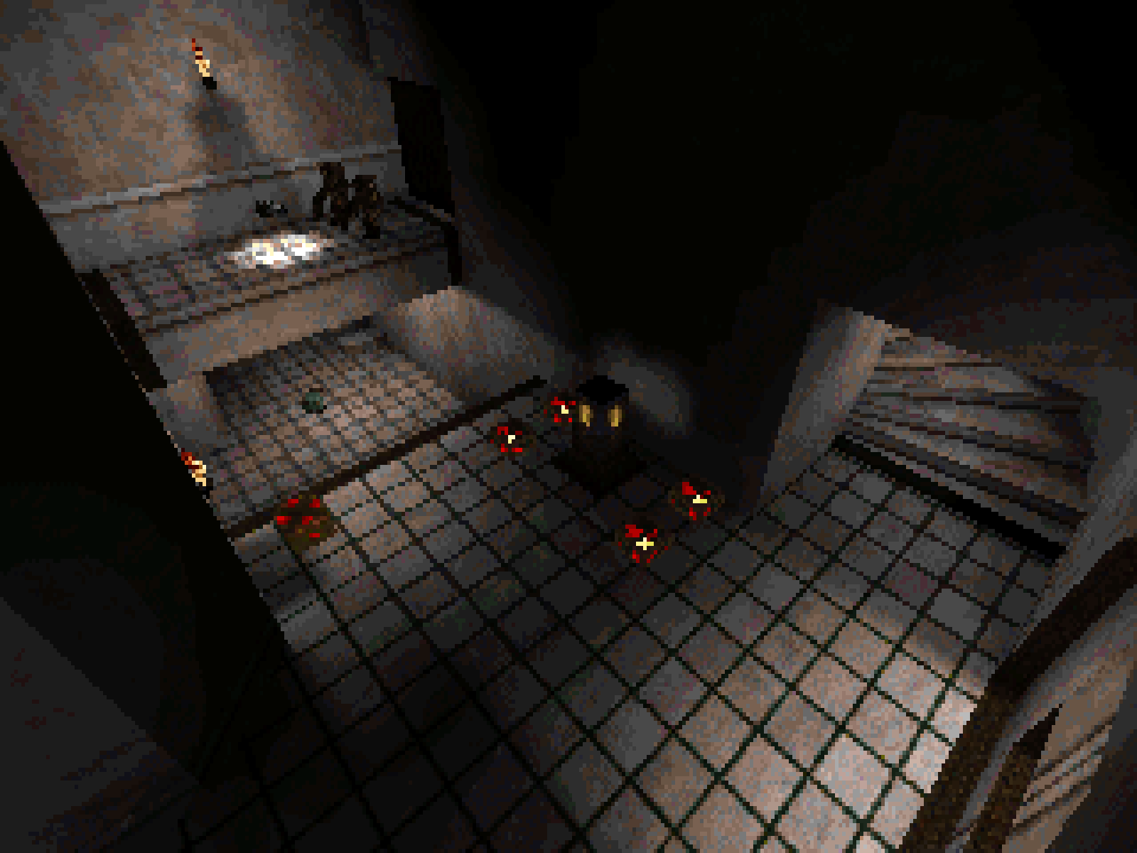
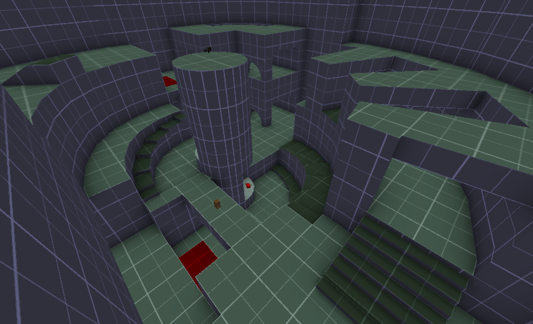
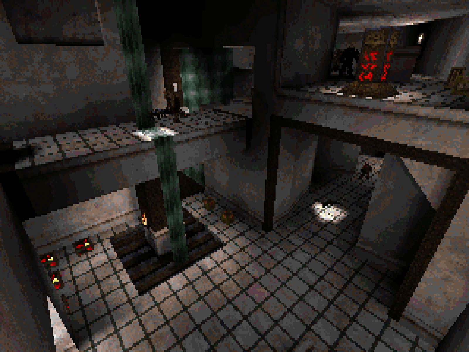
This deathmatch map has long sightlines (probably too long for a DM map as well), big parts of the arena are visible from other parts of it and it was averaging about 1500 world polys in its blockout, before any decorations were even added. A lot of the basic process then was breaking up the larger spaces into (hopefully interesting to play) subspaces that broke line of sight. An example of this is a u-bend turn by the nailgun/rocket launcher, which basically emerged to prevent the two areas it connected from being visible at the same time. Its not that there's no conscious design going into decisions too, but the layout is still significantly informed by the technical restrictions. The original map let you pass through the centre of the spindle either around the sides or on top of the central pillar, but this left too much visible geometry to run acceptably well.
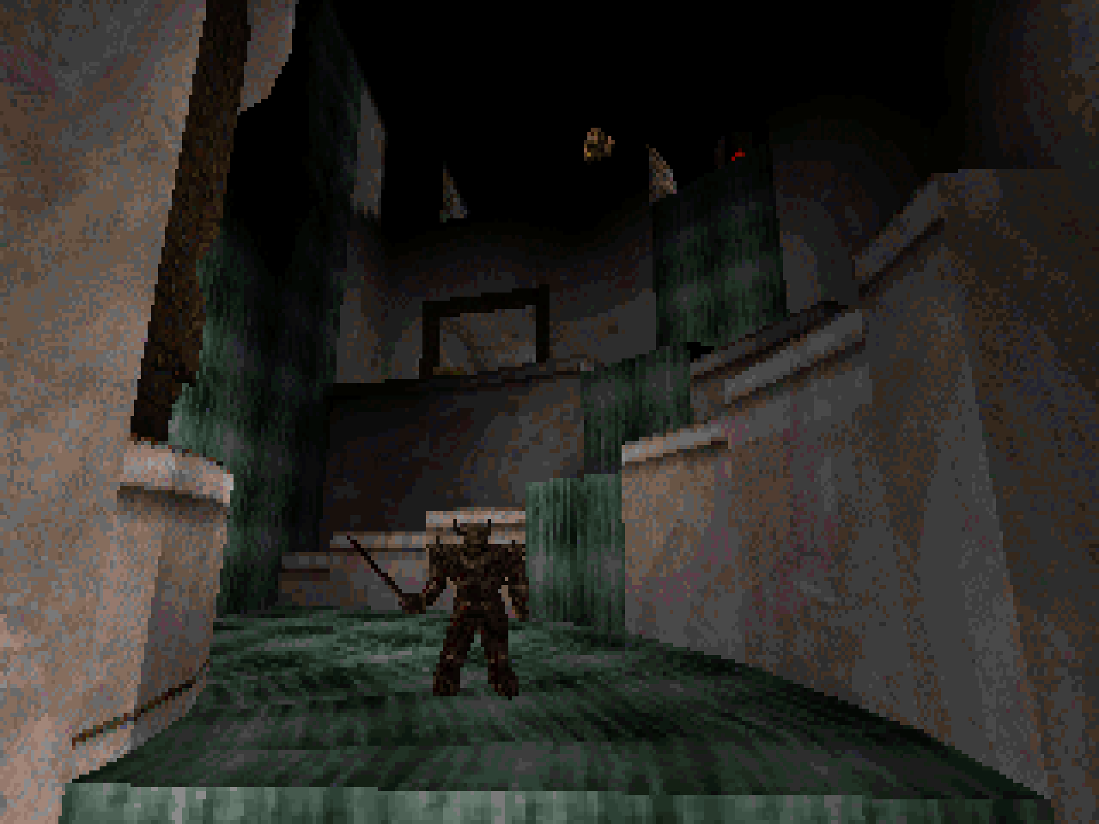
This image is taken from roughly the same position as the one above it. I hope it illustrates how the basic layout remained the same, with various paths and sightlines cut off.
While this was going on, the visual identity started to emerge. There's a really beautiful map in Machine Games' Dimension of the Machine based around a desecrated church. Suspended over a huge chasm, it makes for quite the vista, blocks of white marble pierced and tainted by massive iron pipes. You get the sense it was laid down by the march of industrialism, a parasite erupting out of its innards long before it was infested by monsters. I couldn't hope to make something like that, in general, but especially with the base Quake limits, but its where the basic set of wall and floor textures came from and I hoped to capture a little of that look. I like to have a sense of some sort of narrative in my maps, at the very least in my head, to help focus the map around something. The deathmatch origins and limited scope meant I didn't really have a good sense of this outside of the keys you collect implying some vague emotion: The rune of regret is revealed and so on. This ended up more as a formal and art exercise than I was expecting then, but I think it worked out ok.
Cutting the map up mostly brought performance under control, but there were a few spots where if you looked in a certain direction, you could just about see through to the other side of the map. Notably from the start room you could see through the centre of the spindle all the way to the other side still. Doors don't fix this problem. As moving entities, they can't be accounted for by the compiler and so do not block sightlines. The solution to this then came from the final visual part of the map: that its an enormous cistern with water flowing down from the top parts of the map into the lower. Water volumes in 1996 Quake are opaque and do not move, meaning they are sightline blockers. It would look very strange to have blocks of water floating around the map though and the player would have to swim through them. Make them one unit thick though and cover them on both sides with a non colliding animated waterfall texture and you have a space that blocks line of sight, can be moved through by the player without them noticing its swimmable water since its so thin, and is visually justified. This also works with any 'liquid' brush in Quake, I think there's something pretty similar in Tonhao's map with portal textures going on.
File size was also a problem. 1.44 mb is not a lot, especially when textures take up so much room, so here are most of the things I did or considered to reduce filesize.
- target/targetname strings take space. I went through the .map file and replaced them all with very short abbreviations. Patrol0_1 becomes p01 and so on. This saved about 15,000 bytes in total. That's less than .01%, but it all matters, believe me.
- Textures with huge scales take up very little lightmap data. A few high ceilings that sit in the dark are basically one giant black pixel that mostly blends in if you aren't looking for it. You can also increase the scale of any texture to reduce its lightmap size, though I was able to make enough savings later on that most of the places I did this were reverted.
- Clipping ceiling decorations and shallow hollow surfaces reduces the complexity of the collision hulls and the space they take.
- func_detail_wall: not really a trick but intended modern feature. When two surfaces touch each other, the faces you can't see are thrown away in the compiler step, FDWs stop this happening, at the cost of light leaking underneath the object and culling less geometry (quite important for running on vanilla quake specs). I tried not to use this initially as it wasn't available in original quake compilers but needs must. It was less useful than I assumed it might be though. A lot of testing on different brushes resulted in most of them causing a slightly larger filesize than not using it. I assume because the surfaces they cover then have have to be light mapped where before they would be culled. The big exception was the torch brackets that touch walls. Walling these was a substantial saving, probably because they're so small that stopping them splitting faces is more of a saving than the small surfaces they cover being mapped. This saved about 15,000 bytes. I actually ended up making savings late in the process and making the game more performant by removing most of the Walls.
- Similarly skip textures. Skip textures tell the compiler to never render that surface and so they don't get light mapped. Most moving brushes (doors, plats etc) that would be light mapped have at least a couple of faces that are always inside or facing other geometry and can be skipped. A couple of outward facing textures that the player will never be in a position to see get this too. If you don't use func_detail_wall skip textures can also be a substitute, move the brush one unit away from the wall, then skip the backside of the newly revealed faces. This was probably the biggest modern feature I did concede to.
- Cut down skip and clip textures to the min size of 16x16 pixels, they're hints to the compiler and are never rendered so can be made small.
- Remove most frames of animated textures. The waterfalls have only 3 frames of their orignal 8 and you mostly can't tell unless you stare at them. The same is done to all animated textures. This led also to replacing the red pixels on the pillar button texture with fullbrights, since taking the animated frames away made it less visible.
- Edit all textures to reduce their size by 50%, then scale them 2x in trench broom to keep their world position. This dramatically reduces light map texture size and was something I kept in my back pocket for an emergency. In testing this reduced my file size by about 1/3. I ended up not using it though, it means all your pixels are double sized and look significantly worse. It is a big tradeoff and I decided it wasn't worth it, as I more or less had as much map as I wanted to make even without the extra space.
- Strip light entities out of the bsp, (since they're useless space takers once light mapping is done). Lunaran gave us a python script to do this but I couldn't get the script to run for unclear reasons. A good thing to have for any future projects though.
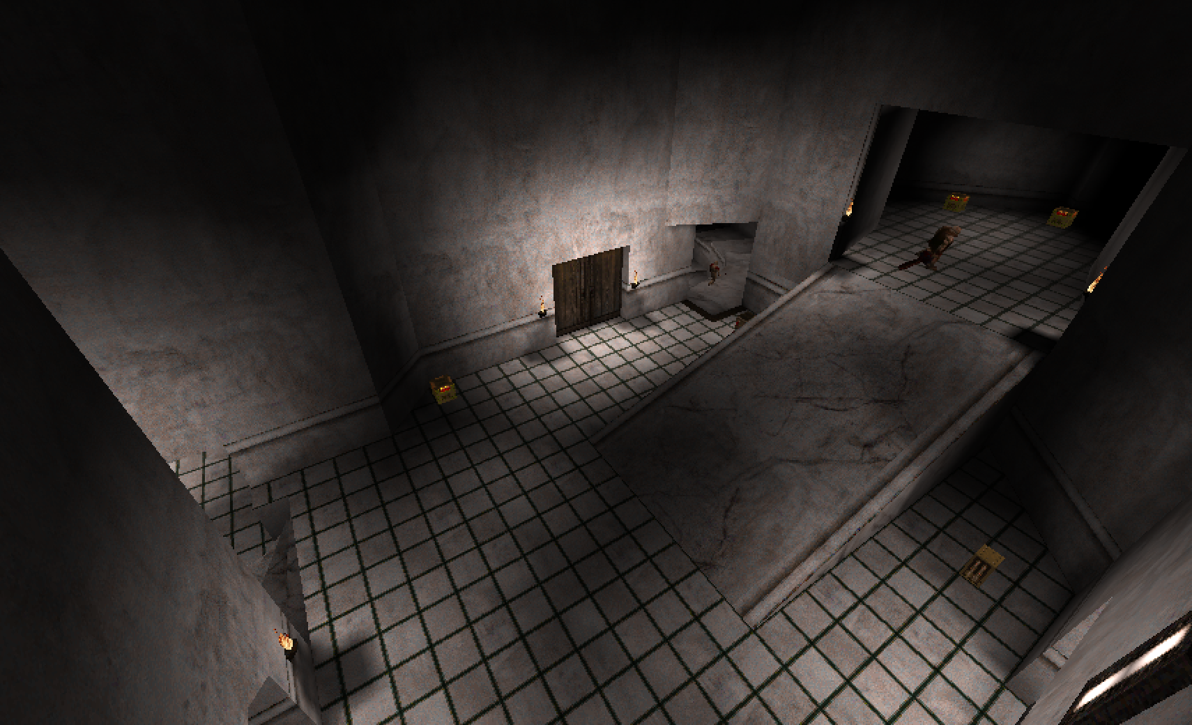
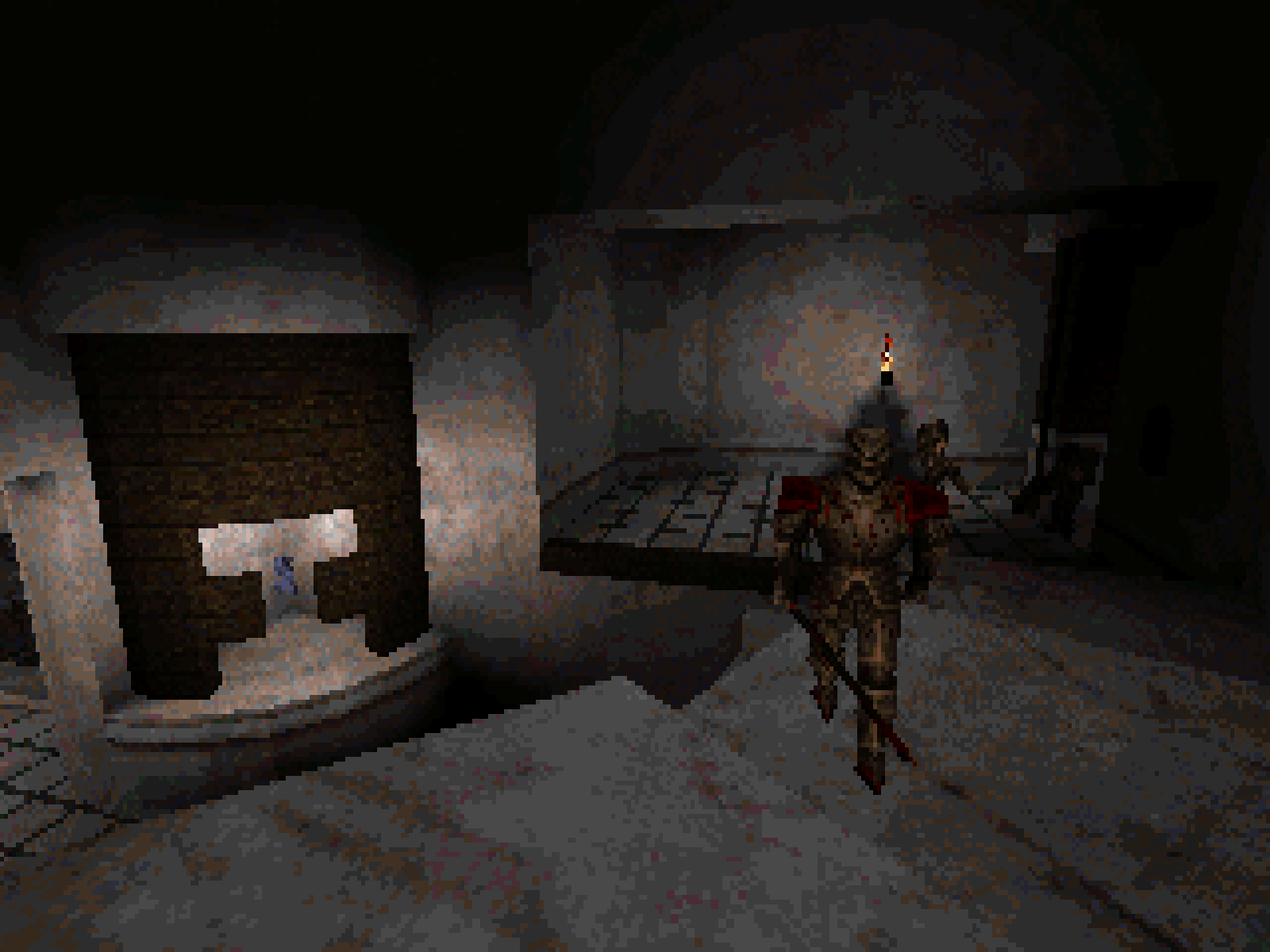
Lighting is a challenge. This was a place where there was some choice. It is quite possible and completely acceptable to use modern compilers to get more sophisticated lighting than was available in 1996, while still being fully compatible with the original game. It doesn't change the type of data the game uses, just the sophistication of the data you're giving to it. Modern compilers offer things like bounce lighting and different light falloff settings rather than the completely linear falloff of the original game. This is both quicker, and makes for far more naturalistic lighting. Without it you basically have your key lights, then put a huge amount of fill lights around, which is both time consuming, and looks a little odd if you ever stop and think about it. In the name of authenticity I ended up sticking with the basic tooklit. No bounce lighting, no super sampling, linear falloff. This was a huge mistake and ruined my life, especially as every individual light takes up file size. It takes a very long time and is quite tedious.
At this point the map was basically done. I had the normal difficulty implented, lighting and triggers all set up, and was just about scraping by on file size. The final hurdle was difficulty balancing. My usual workflow is to duplicate all enemies and pickups onto different trenchbroom layers and toggle each entity set to a different difficulty. This lets me hide entire difficulties and work on each seperately, rather than having to click each entity and check its settings to see what difficulty they're one. More entities, more data though, so I had to suffer the inconvenience. At every step in this late process, imagine also that I was constantly drifting over the file size limit and then scouring the map for ever smaller micro savings to bring it under agin.
I also really wanted deathmatch support but again seperate entities (deathmatch spawns etc.) meant more size. Where possible, I reused pickups from the singleplayer map (since existing items can be flagged to appear in deathmatch without adding a whole new entity) but this isn't really a great way to balance a map. I suspect in any non casual play, most of the action would take place in a few hotspots on one side of the map because of the way key items are distributed, which I did try to compensate for with additional item placement elsewhere. Without battle testing though, I have no idea how effective this was, sadly. I do still want to bully some friends into playing it sometime and see what happens.
I made it though, the cumulative scraping and scrimping left me at the exact limit of 1,457,664/1,457,664 bytes. Nice and tidy.
So as I crawl through the finish line, what, If anything, did I learn?
- This shit is hard. Its obvious to say, but difficult to really appreciate how much of Quake's map design was informed by the technical restraints of their technology (it is also worth bearing in mind that modern editors are leagues ahead of what was possible in those early days). That they created (mostly, fuck off Sandy, you made some dire maps and are a dickhead to boot) such cohesive and evocative maps is a testament to the technology but perhaps even more to the skills of the artists and designers who drew so much blood from Carmack and Abrash's stones (there has to be a better way of phrasing that).
- Constraints can be good for creativity. Again this is obvious, but always worth being reminded of. Perfomance and file limits, onerous as they are, put a hard cap on the scale of what you're making. It forces you to make hard choices and really figure out what parts of the map are most important to you and what can be safely discarded.
- As much as its fun in retrospect to laugh at John Romero being seduced by coloured lighting and so helping to torpedo Daikatana, being forced to go back to white lighting only really emphasises how powerful a tool coloured lighting is, and exactly why he made that choice. Its hard going back to white lighting in 2026, I cannot imagine how exciting looking forward in time to it was in comparison.
I wrote the bulk of this a few months ago, but am posting it on the day of Quake's 30th anniversary. On the one hand its kind of amazing that such a conservative game wrt its basic design still has its hooks in people (me) 30 years later. Really though I think this simplicity, this stripped back design, is what sustains it. Its pretty much perfectly positioned as a kind of ur-fps. You couldn't really make a game like this now, because quake has gently but firmly occupied that cultural spot, nothing made now is really allowed to be quite this straightforward. Its just a hair complex enough to carry the player along in combination with its stellar mood, simple enough that it can be reformed like clay in the hands of the people who continue to be inspired by it into endless little experiences and narratives. Its been a long road with no particular destination and long may it continue. Good shit.